Designing a scalable motion language for the Google Safer campaign.
Google, Safer
Agency: Hello Monday
Project: Product design
Year: 2021
—
Key motion concepts, animation, asset design, branding
In the 21st century where generations are growing up more connected than ever, it's important for people to feel protected. Not only physically protected but digitally protected. We want to out our trust in technology and be sure that our privacy is protected and our data is safe
Google Safer approached Hello Monday to work on a full branding exercise, rethinking the communication and brand representation. Running in parallel was a workstream that involved a large social campaign.
We needed to have a motion component that felt consistent and could scale for social media and broadcast.
I worked with the art directors and client to establish some motion principles and rules around how to treat key elements in the brand.
I designed the motion to feel secure by having elements that snap into place. The movement is sharp is some areas to create a sense of responsiveness and trustedness. Since we were using simplified UI conventions across all major products, we tried to keep the motion 1:1 with the product we were emulating in the ads.
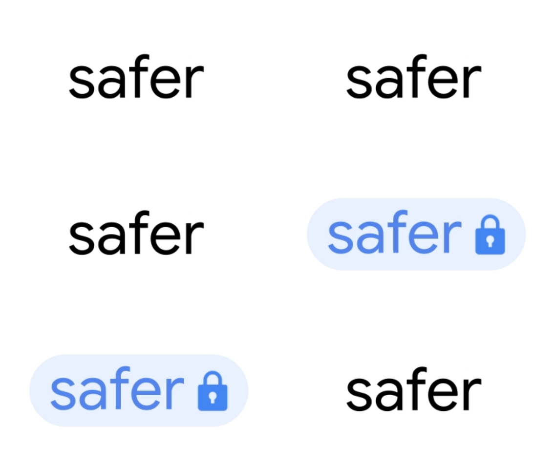
The motion design adds subtext and little details that emphasize the message, branding and feeling of security.
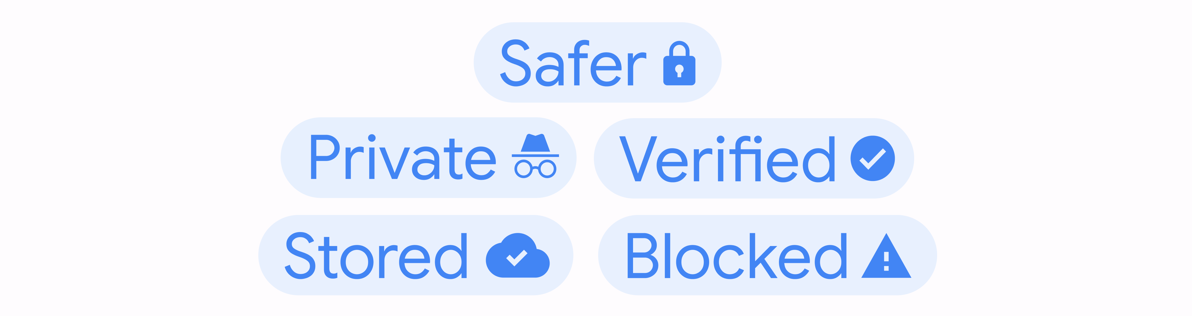
The brand’s visual language leanded heavily on recognizable context. Using large text, simplified UI, and this pill+icon lockup to highlight some of the ways Google keeps users safe.
I wanted to make sure that the simplified UI was close to the expected behavior of the real deal. I also wanted to make sure the hero icons had enough life in them to draw some eyes without distracting from the messaging.